Analyzing Pairs with Correlation and Cointegration
Pairs Trading or Market Neutrality have long been seen as complex hedge fund style strategies with limited application for the retail trader. As part of our series on Correlation and Cointegration, we thought it would be beneficial to look at how both regression patterns can be used effectively to identify pair trading opportunities and scenarios, and how to reduce possible pitfalls.
The mystery that surrounds Cointegration and its complexity from a formulation point of view has somewhat put off many traders. Funnily enough, even as I write this post the spell check does not identify Cointegration as a word, which gives you an indication of how often the term is referenced.
Identifying Good Pairs Trades
Although there are a number of formulas or tests that can be used, one of the most widely adopted is that of the Augmented Dickey Fuller (ADF) Test. Formulating a p-value, the test allows the trader to identify how cointegrated two series are over a specified period in an efficient and simplified way.
To put this into context, if the prices for currency A and currency B are inputted into the model and the p-value comes out at 0.02, then this identifies that 2% of the time the two variables are not stationary or 98% of the time they are cointegrated. Make sure that you use a good number of values (eg 3 years on a daily chart), otherwise the calculation may not give you the most accurate indication.
There are a number of sites where you can download an excel version of the ADF test including www.quantcode.com
The next part in the calculation process is to work out the correlation. It is recommended that multiple time frames are used to also paint a picture of the cycle of the linear regression. To highlight how much of a discrepancy there can be, we ran scans on the EURUSD/GBPUSD and Gold/Silver Pairings. Results were very interesting.
- Example 1: EURUSD and GBPUSD
30 Day Correlation: 73.46%
2 Year Correlation: 64.89%
13 Year Correlation: 89.20%
2 Year Cointegration: 13%
The long term correlation indicates that the pairs track a very similar path. However on a short term basis, they will gradually move apart. On a cointegration basis, only 13% of the time over the last two years have the pairs reverted back to the same mean.
- Example 2: Gold and Silver
30 Day Correlation: 94.98%
2 Year Correlation: 26.99%
13 Year Correlation: 95.3%
2 Year Cointegration: 85%
The two year interval highlights how the prices are statistically out of their long term and short term ranges. According to the cointegration figure, the prices of both Gold and Silver reverted back to the same mean 85% of the time.
Conclusion: Gold and Silver is a better pairs trade than EURUSD and GBPUSD.
Cointegration and Correlation Technicals
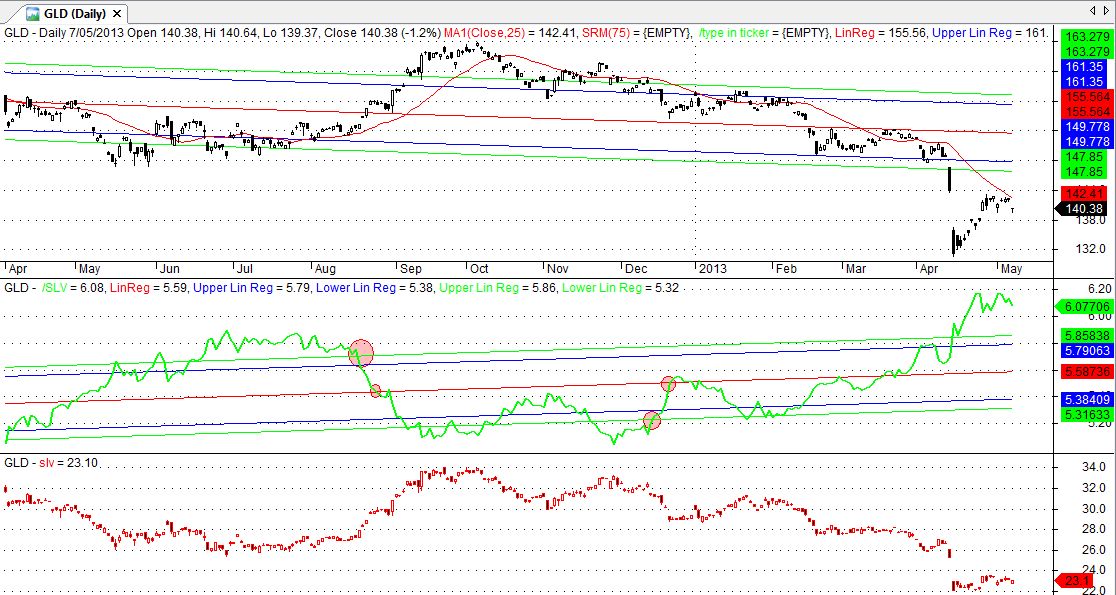
Now that we determined that gold and silver show the highest correlation and cointegration, we need to analyse the technicals for specific entry and exit points. In the below example, there are three specific graphical representations (top chart is the gold price, middle chart is the regression correlation, and the bottom chart is the Silver price). The linear regression period is 360 days with no look back.

A chart showing gold, silver and their correlation
The diagram had two possible entry and exit points over the one year period. In August, the 360 regression channel indicated that the linear value would revert to its mean after a period above the 3rd standard deviation.
According to the chart, a Short Gold and Long Silver pair signal would have been triggered. The second trade came in December, with the linear line breaking back through the bottom standard deviation channel.
Pitfall
With reference to the above example, we can see a number of issues that could greatly impact performance. Curve fitting as it is commonly known is best described as a specific series fitting a time variable without giving a true and clear picture of performance.
Strategies that require definitions from future pricing or large historical data are usually curve fitted. On paper it may look great, but in real trade scenario, the results may be completely different.
The 360 regression channel chart did not pass the out of sample (curve fitting) test. As can be seen below, when the look back period is amended to 162 Days, the signal would be completely different.

A moving window for the regression channel provides fewer opportunities for curve fitting
Solution
One of the solutions for curve fitting in pairs trading is to reduce the linear regression period to a shorter window or time frame. Although this can result in sensitivity to volatile movements, this reduces the potential risk to forward looking scenarios. Traders should also be aware of changes in the correlation and cointegration values of the pair, as these can shift quickly due to market mispricing or global economic and political events.