The Layman’s Guide to Correlation
It’s the 4th of July weekend. My wife is running errands this afternoon and my youngest son is napping. I can’t go outside for a run – it’s July in Texas (i.e., incredibly hot) and, what if the baby wakes up? The only ways to spend my holiday afternoon was either to a) watch TV or 2) dive into Michael Halls-Moore’s recent article, “Series Correlation in Time Series“.
I’m going to skip the math and keep this very layman friendly. There are some key take aways that even the most mathematically challenged traders can learn.
The Layman’s Guide to Correlation
Let’s go easy on the mathiness and remind ourselves what correlation is. Correlation is directly related to the angle between two points.
It’s easiest to understand in two dimensions because that’s what fits on a piece of paper or computer screen. The points (1,0) and (2,0) share an angle of 0°. Basically, the points lie on the same line.
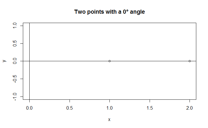
Correlation is directly related to the angle between two points. These points lay on the same line, so the angles between each other are 0°. The fact that they are on the same line makes them 100% correlated.
Correlation is the cosine of the angle between two points. Get out a calculator and try it. The cosine of 0° is 1.
cos(0) = 1.0, which is 100% correlation.
Look at the image above. The points (1,0) and (2,0) share the same line. Doesn’t it make sense that points on the same line are 100% correlated? Points that are less than 100% correlated lie on different lines.
To keep this intuitive, you probably know from trading that a 60% correlation is worth paying attention to, but it’s not very predictive. What does that mean geometrically?
We want to get the angle where cos⁻¹(θ) = 0.6. Please don’t get caught up on the cosine stuff. I just want you to realize how this relates to angles.
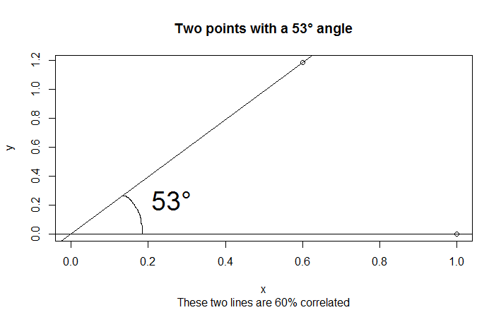
The angle with a 60% correlation is 53°. They’re kind of close together, but not too close.
Those lines are pretty far apart. A 60% correlation between two forex pairs puts you in the same ballpark, but you’re hardly tracking pip for pip.
Forex prices are like points on the graphs above. 1 bar ago, 2 bars ago… 16,000 bars ago the prices of EURUSD were 1.11342, 1.11297…. 1.31974. The historical data on EURUSD forms a point in space. It’s 16,000 dimensional space, which is completely incomprehensible mentally, but it’s still a point. That means you can draw a line to it!
We usually talk about correlations in forex by comparing two currency pairs. Most traders know that EUR/JPY and GBP/JPY are correlated. You’re drawing a line between 0 and the EURJPY point, then drawing a line between 0 and the GBPJPY point, then calculating the angle to determine the correlation.
The EURUSD example only lets us draw one line. What if we compare the EURUSD against itself with a lag? That would let us draw two EURUSD lines!
The memory function
Using the EURUSD example, you naturally expect a 100% correlation if you drew the same line twice. It’s the same series of prices. That on its own doesn’t tell us too much.
The idea of autocorrelation is to lag the prices. Right now is 15:00. I can take the prices from 15:00, 14:00 and 13:00 and compare it with a one hour delay. The new delayed series are the prices from 14:00, 13:00 and 12:00. A one hour gap is 99.9% correlated with the original price series.
Michael’s article encouraged me to look at bigger and bigger time lags.
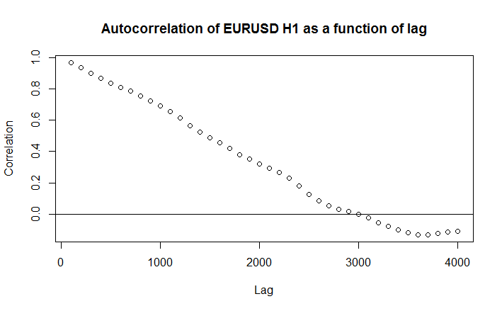
The correlation of EURUSD decreases against itself as the time lag increases.
The number on the horizontal axis is the time lag, done in groups of 100. The vertical axis shows the correlation.
EURUSD loses all its information after around 3,000 hours of data. That’s about the point where the correlation function reaches 0%.
Autocorrelation is often called the memory function. Traders can use this to ask themselves the question, “How far back in time can I go and still obtain useful information?” I can tell you with high confidence that if you’re trading one hour charts, it’s useless to consider anything beyond 3,000 hours.
My personal threshold for significance is a 75% correlation. EURUSD maintains that autocorrelation through 800 bars of data, which you can see on the chart if you zoom in closely.
The take-away for traders is that once you go past around 1,300 bars back, your information rapidly becomes less and less valuable.