One line of code makes all the difference
I was really excited about my Pilum strategy two months ago. The research looked great and everything was ready to rock and roll. Demo testing began and then… not much happened.
The Quantilator is (mostly) finished, which finally gave me time to circle back and review what happened with Pilum.
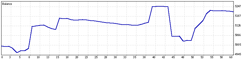
Live demo trading of Pilum. Dec 9, 2016 to Feb 7, 2017
The expected outcome was that I would win 75% of the time. Trades were infrequent, so I thought maybe I’m just having bad luck. But then my win rate remained stuck around 50%. Simple statistical tests told me this was unlikely to be bad luck.
I used the research time to pour over my research code and to compare it with live trades. What I found was that a single line of code (AHHHHHHHHHHHHHHH!) was incorrectly calculating my entry price, dramatically overstating the profits.
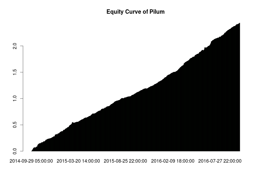
The flawed code produced this equity curve from a single combination of settings:
When the actual, correct result looks like this with those same settings:
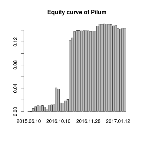
The accurate backtest of Pilum
I’ll be honest… I like the flawed backtest a lot more!
The new, single-setting backtest isn’t as good, but it’s still trade-worthy. There are some characteristics that I dislike and features that I love. Let’s dig into those.
What I dislike
The frequency of trades is very low. Out of 19 months there were a total of 43 trades. 43 trades to comprise a backtest on 40+ instruments is a very small number.
If it weren’t for the statistical pattern backing up the frequency, I would not consider the test. However, there are 20,000 bars each on the 44 instruments. There are 880,000 total bars used to analyze whether my Pilum pattern offers any predictive value.
The most valuable predictions, however, are also exceptionally rare. That’s why I’m not able to get the trading frequency higher, which would potentially smooth the returns.
What I love
My previous systems like QB Pro and Dominari traded actively for relatively small wins. Trading costs exercised a massive impact on the overall performance.
The accurate backtest of Pilum
Now look again at the correct equity curve (the image to the right). Do you see the final profit of roughly 0.14? That’s a 14% unleveraged return over a 19 month period.
Allocating 2:1 or 3:1 leverage on this strategy could average annual returns of 15-25%.
Detecting hidden risk
A key measure of risk is skewness. You may not use that term yourself, but it’s something most of you already understand. The biggest complaint about people trading Dominari was that the average winner relative to the average loser was heavily skewed towards the losers.
Dominari wins on most months, but when it lost in December it was devastating. I implemented what I thought was a portfolio stop after the December 9th aftermath. Then I had a smaller, but still very painful, loss in January. The portfolio level stop loss of 3% should prevent future blowouts now that I know what goes wrong.
I still believe in Dominari. But, I obviously lost the work of most of the year due to those events.
Knowing that skewness is a good measure of blowout risk (even if you’ve never seen it in a backtest, like happened with Dominari), Pilum looks extremely encouraging.
This is a histogram of profit and loss by days. You should notice a few things.
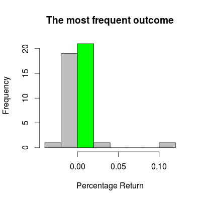
The tallest bar is to the right of 0. That means that the most frequent outcome is winning.

The biggest winning day is dramatically better than the worst losing day. The worst outcome was a loss of 2%. The best outcome is gains near 10% in a single day (unleveraged!).
This is the statistical profile of an idea that’s much more likely to grab an avalanche of profits than it is to get blown out.
It gets even better
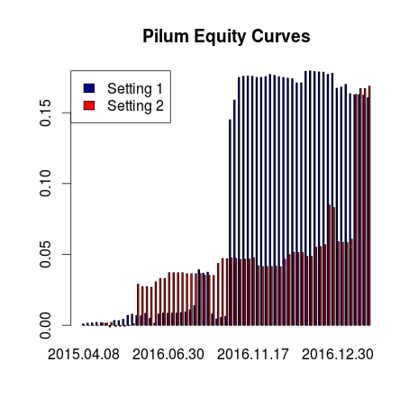
Would you say that the blue and red equity curves are highly or loosely correlated? Look closely.
Writing this blog post made me think carefully about the Pilum strategy. I decided that maybe I should see if all of the profits are coming from different settings at the same time. There’s very little risk of overfitting the data as my strategy only has 1 degree of freedom.
The blue bars are the equity curve of Setting 1.
The red bars are for Setting 2.
Do you think these are tightly or loosely correlated?
If you said loosely correlated, then you are correct. Notice how each equity curve shows large jumps of profit. Did you notice how those profit jumps occur on different days?
The blue setting skyrockets on a single day in November 2016. It leaves the red equity curve choking in its dust.
But then, look what happens as I advance into December. The red curve dramatically catches up to the blue curve and even overtakes it.
The correlation between the 2 strategies is only 57%.
Combine multiple settings into 1 portfolio
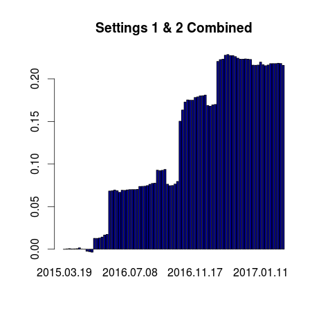
This is a much nicer equity curve!
Loose correlations are a GIFT. Combining two bumpy equity curves into a single strategy makes the performance much, much smoother.
The percentages of days that are profitable also increases. Setting 1 is profitable on 58.0% of days. Setting 2 is profitable on 53.5% of days.
But… combining them makes Pilum profitable on 68.2% of days. Awesome!
That also provides more data, which puts me in a stronger position to analyze the strategy’s skewness. Look at the frequency histograms below. They’re the same type of histograms that I showed you in the first section of this blog post. As you’ll notice, they look a lot different.
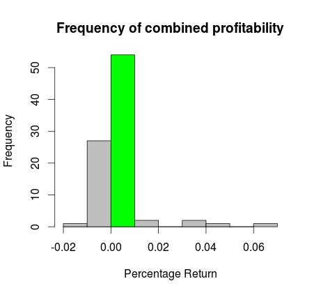
The most probable outcome for any given day is a small winner
The tall green bar is the most probable trading outcome for any given day with filled orders. The average day is a positive return of 0-1%.
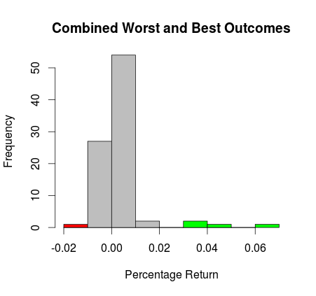
The small red bar is the worst trading day of the combined strategy.
The small green bars are the best trading days of the combined strategy.
Look how far to the right the green bars go. The largest winner is more than 3x the biggest loss. And, there are so many more large winners compared to losers.
Giant winners are far more likely than comparable losses.