Analyze your Trading Algo with 3D Charts
These days, any mention of the term 3D is associated with entertainment. But in fact, when it comes to charting, and more specifically to charting your trading algo, 3D charting is not only insightful but provides important practical advantages.
The most common chart to measure a trading algo is profit over time. That lets you know how much money the algo is making over a specific duration, usually from a few weeks to several months. As the chart below illustrates, it gives you a good idea how well your trading algo performs over time and it gives an indication of the periods when it was underperforming.
The thing is that, while profit over time are the two most important dimensions, they leave plenty of dimensions out—dimensions that can help you answer important questions. Such as why, during a specific period, was your trading algo under-performing? Or how much risk are you taking in a given time? Often, the answers to such questions can be the difference between profit and loss, between success and failure of a strategy.

Trading Algo in 3D
First things first. Before we start running 3D charts on our algo it’s important to go over a few practicalities and make the 3D chart work for you.
Assuming you’ve already exported the data of your algo Profit and Loss to Excel you’re likely to have two columns of data, e.g. Time and Profit. Adding a third column will allow you to run a 3D chart, whether it’s volatility, risk or whatever additional dimension you deem necessary.
Once you have your three columns you click to generate a chart—you must choose a type called 3D surface chart. As you will notice, almost always, the Time stamp will be the X-Axis, Profit the Y-Axis and our third parameter will be the Z-Axis.
Now comes the important part—making the chart comfortable to work for us.You must remember that our goal in using a 3D chart in the first place was to identify areas of either exceptional profits or exceptional losses to optimize our algo.
As can be seen in the charts below, Excel divides the Y axes into ranges and each range is colored. The best practice is to choose the same color for levels that are not exceptional and select a contrasting color for the highest range and another for the lowest range. This allows us to spot the exceptional.
The Z axes changes the angle of the chart; the steeper the angle, the higher our Z parameter—say risk or whatever else we choose.
And finally, make the 3D chart clearer through formatting the Plot area. Play with the Y rotation angle as well as the Debt Level until you are comfortable working with the chart
Trading Algo Case Studies
Once you are clear as to how to make a 3D chart, it’s time to decide which dimension is relevant. Usually, besides time and profit, the following dimensions are worth considering—risk, volatility and duration.
For example, the chart above shows a profit over time of a specific strategy; let’s call it Strategy A. Suddenly, out of the blue, the profit plunges rapidly. It’s not clear why, yet.
Then we add another dimension—risk. Risk, in this case, will be the Dollar amount risked in a given moment. Now, the reason is apparent; just before the profit collapsed, risk was rising, as well. Maybe leverage jumped, maybe several positions were opened simultaneously; it depends on the strategy. But by using a 3D chart we were able to easily detect where trouble was coming from.

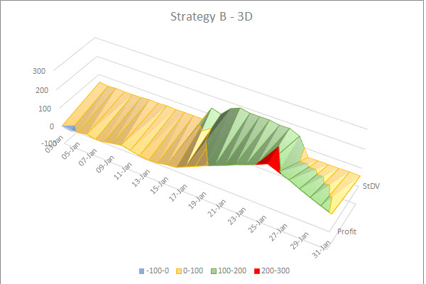
Using 3D charts is not only good to spot weaknesses in a strategy but strengths. Let’s take a look at another strategy, which we’ll call Strategy B.
We will test how Strategy B performs during volatility. In this case, the volatility will be the standard deviation of each pair we trade. What we see is interesting. When volatility is high, Strategy B performs exceptionally well and not so well when volatility is average to low.

In such a case, we should consider using the strategy only during high volatility to optimize returns.
More uses could be to measure duration per trade. If the duration is getting longer at certain areas perhaps the trigger for the entry or exit is not working well. The benefit with using a 3D chart here is that we put the opening time stamp on the X-Axis and the closing time stamp on the Z-Axis so we can actually analyze duration per trade over time. A 3D chart then is much more accurate than a two dimensional chart where duration is a trailing average.
In Conclusion
There are endless samples and ways in which 3D charts can allow you improve your trading algo and identify both weaknesses and strengths within your strategy. Sure, you can manage with a 2-dimensional chart. But the benefit of 3D charting is that, many times, it allows you to zoom in and identify areas of change much easier.